What’s the first thing that comes to mind when we think of a company, brand or organization? For most people, it’s probably the logo. A logo isn’t just for the customers; it also serves as a symbol for the employees of that company and helps it distinguish itself from the competitors.
It can highlight what a company or an organization stands for and what makes it different from the other. Also, every logo like its company has its own fascinating backstory and has gone through an evolution of redesign and changes, to reach its current state.
Like the iconic bitten Apple logo, that has its own interesting backstory. The original logo, created by Ron Wayne, depicted Isaac Newton sitting under an apple tree. This was soon replaced by the iconic bitten apple designed by Rob Janoff in 1977.
The bitten Apple design is now universally recognizable with the bite adding a unique twist to the shape making it more distinctive. According to its designer Jannoff the bite was added so that people would not mistake it for a cherry.
Some people also say that the logo was designed as a tribute to the British computer scientist Alan Turing who had allegedly committed suicide by taking a bite out of a cyanide laced apple. However, Jannoff refuted this interpretation and had said in many interviews that the logo has no connection to Turing.
Not just Apple’s, there are many companies that incorporate elements in their logo which make it distinctive. Some of the elements included in the design may seem like simple design choices but most of the time they are intentional and have an interesting backstory and also add depth and meaning to the design.
For instance, the Facebook logo is blue because its founder Mark Zuckerberg is red-green color blind and the color he best perceives is blue and hence the color of the logo.
Here we have compiled a list of some similar logos which have some hidden elements in their design.
FedEx
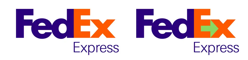
FedEx is an American multinational conglomerate with its operations spreading across many nations. It provides transportation, e-commerce and business services but it mostly markets itself as a fast and reliable, rapid transportation service.
That is also reflected in the logo that has a hidden forward arrow in the design. You will have to look at the negative space formed between the letter Ex in “FedEx”. According to the designer Lindon Leader, ir represents speed and precision.
Toblerone
This Swiss chocolate bar is famous for its distinctive triangular design. The packaging features the famous Matterhorn Mountain of Switzerland. The Toblerone logo has a hidden bear within the mountain image, symbolizing the Swiss city of Bern where the chocolate is manufactured, also known as the “City of Bears.”
Tour De France
Tour De France is an annual cycle race held in France and also touted as the most prestigious in the world. The Logo for this race, designed by Jon Guenon has a handwritten style but if you look carefully you would notice a cyclist hidden in the letter TOUR.
Pittsburgh Zoo & PPG Aquarium logo
The zoo’s logo has hidden images of a gorilla and a lion facing each other, created by the white space around the tree.
Sony Vaio
The Sony Vaio logo combines an analog wave (the “V” and “A”) and a digital signal (the “I” and “O”), representing the integration of analog and digital technology.
Amazon
The Amazon logo has an arrow that goes from “A” to “Z,” representing the wide variety of products available. The arrow also resembles a smile, indicating customer satisfaction.
Toyota
The Toyota logo comprises overlapping ovals that form the letter “T” for Toyota. Additionally, all the letters of the word “Toyota” can be found within the logo.
Hyundai
The Hyundai logo, which resembles an “H,” also represents two people shaking hands, symbolizing trust and satisfaction between the company and its customers.
Home for African Children Initiative
The logo contains the shape of Africa created by the silhouette of a child and an adult facing each other.
NewMan
It’s a French clothing company. The logo may not stand out for its design but if you look carefully you will see that it looks the same if you put it upside down, still forming the word NEWMAN.
Eighty20
This logo for a South African Analytics Consultancy company may not have a very appealing logo but it would definitely appeal to its target clientele. The squares in the logo represent digital bits 1010000 and 0010100, with 1 represented with dark squares. The squares in binary mean eighty and twenty.
The logo also represents the 80:20 rule also known as the Pareto Principle which says that 20 percent of the input produces the 80 percent of the output or 20 percent of the client base generate 80 percent of the company value.
Sun Micro Systems
Sun Micro Systems was an american computer and software company which was acquired by Oracle in 2010. However, the company logo is still remembered for its unique design. The logo is formed by using N and U to create the square shape. The top half of this square reads SUN from all sides.
Baskin Robbins
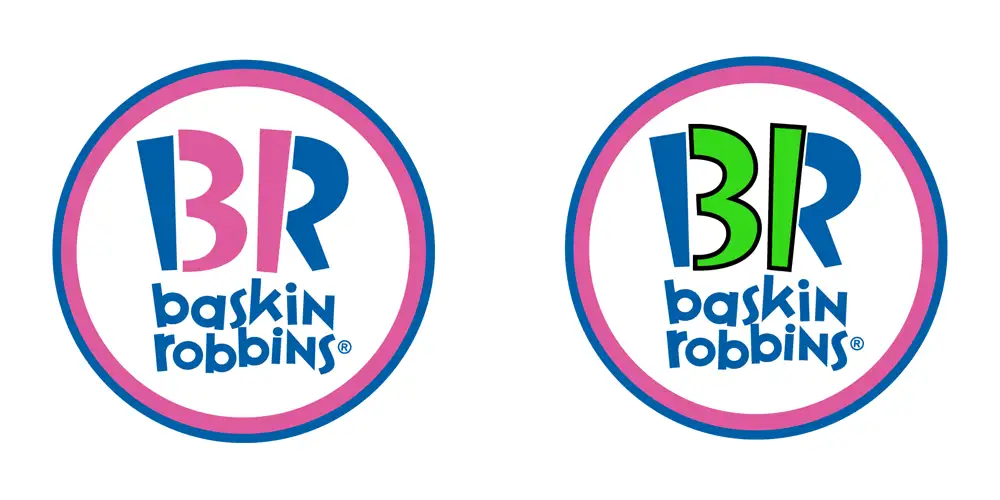
Baskin-Robbins is an American multinational chain of ice cream and cake specialty shops.The Baskin-Robbins logo features the number “31” hidden in the “B” and “R” of the logo, which represents the original 31 flavors of ice cream.
Gillette
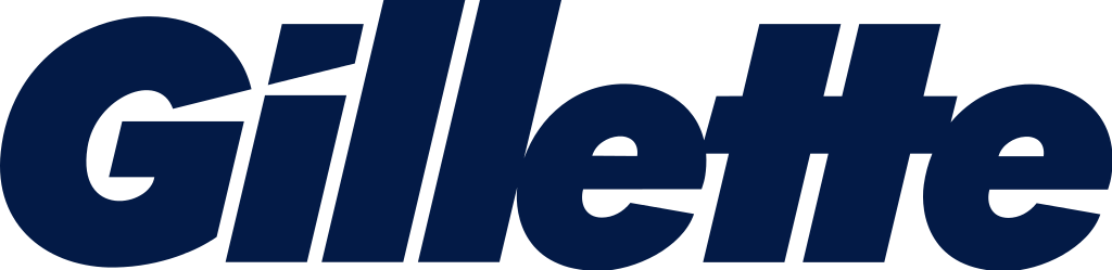
The diagonal line in the first two letters G and I actually represent the sharp and precise cut or shave by gillette razor blades.
London Symphony Orchestra
The logo for the London Symphony Orchestra subtly forms the letters “LSO” with a single, flowing line resembling a conductor’s movement.
Cisco
The Cisco logo features vertical lines that represent the Golden Gate Bridge, linking it to its headquarters in San Francisco, as well as digital signals.
GoodWill
The Goodwill logo features a smiling face created from the lower part of the “G” in “Goodwill.” The logo known as Smiling Face, according to goodwill.org represents the many smiling faces and positive impacts achieved through Goodwill programs and services, every day.
Beats By Dre
Named after famous hip-hop music producer Dr. Dre, these premium headphones have a unique design which makes them stand apart from the others. The headphones are called beats and if you look carefully the logo looks like a head with headphones on.
Spartan
The Spartan Golf Club logo combines a golfer swinging a club and a Spartan helmet, with the design cleverly overlapping.
Unilever
The Unilever logo is made up of 25 icons that represent the company’s products and how they are served. The logo’s big blue “U” stands for Unilever, and each icon has a hidden meaning that represents an aspect of the company’s business.
For instance, the strand of hair symbolizes beauty and shampoo products. The spoon symbolizes nutrition and food products.
Families logo
This logo designed by Herb Lubalin is not owned by any organization or company. However, this typeface logo has an unique and original design. The letters “ili” have been used to give a new and unique meaning to the logo.
Yoga Australia
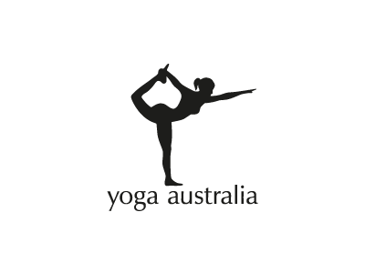
This logo designed by Roy Smith on Dribble uses the negative space in a very clever way. The logo hides the map of Australia in the negative space formed by the hand and the leg.
Eight Logo
This logo’s individual letters have been formed by using the cutout of letter ‘8’.